


Primary symbol
Choose the mark or word that should command attention. Record its height relationship rather than asking for a generic “3D effect.”
Turn a flat brand mark into a controlled dimensional component by defining what rises, what recedes, where colors meet and how the finished patch joins its product. Teebling uses the buyer’s authorized artwork, receiving-product information and sample criteria to review the exact custom rubber-style patch scope.
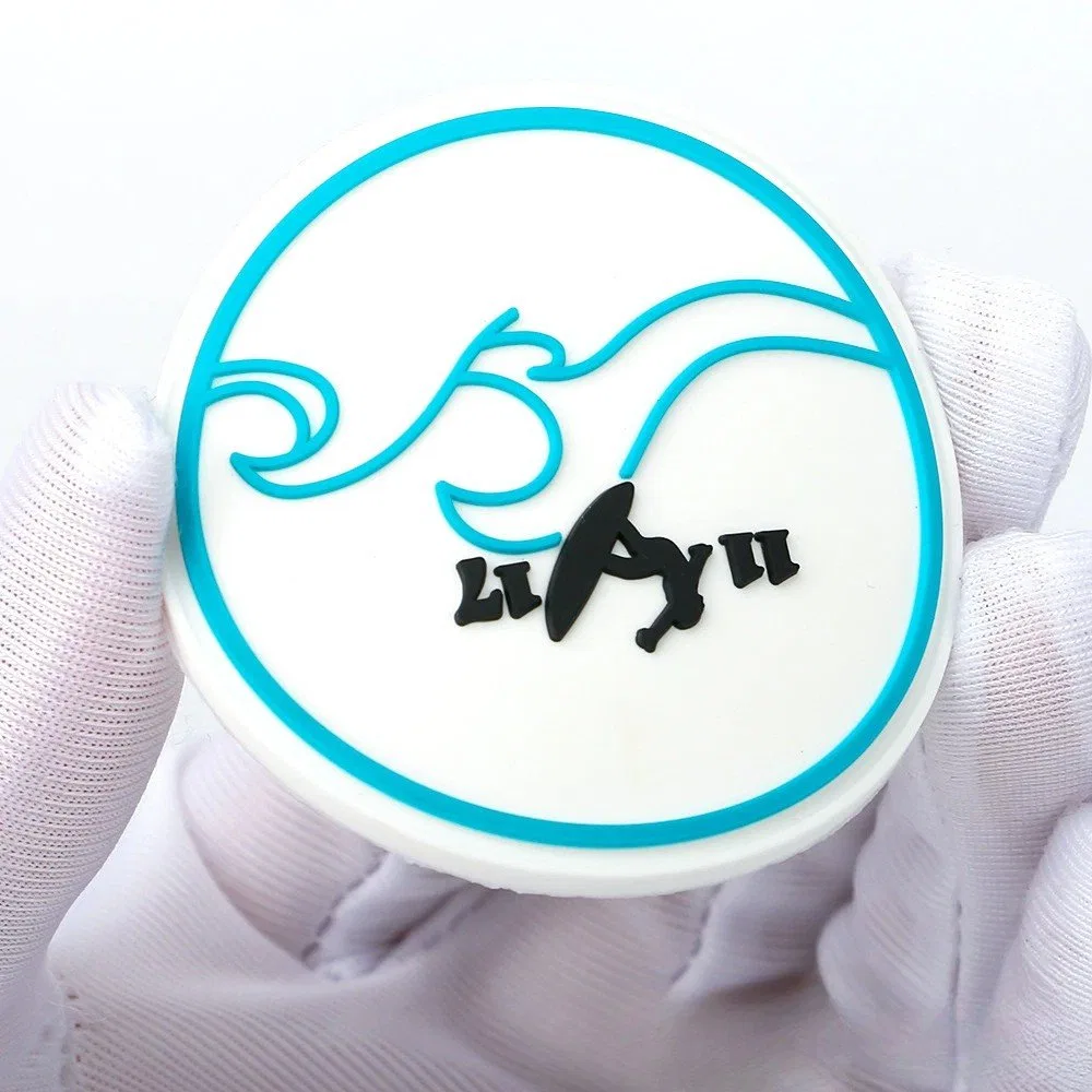
A flat logo contains shapes, overlaps and color relationships, but it does not state which zones should have physical height. Begin by naming the visual hierarchy: the element that leads, the support field, the details that must remain readable and the negative spaces that keep them separate.
Choose the mark or word that should command attention. Record its height relationship rather than asking for a generic “3D effect.”
Define the background or base around the logo and whether it is visible as a deliberate color zone.
Protect counters, gaps and separation between shapes. These spaces need to survive at the approved finished size.
State whether the patch follows the artwork outline or uses a simpler perimeter for attachment and handling.
Describe relief as a small set of intentional planes. Too many competing heights can make the approved mark difficult to read and harder to inspect. Teebling can review a proposed stack, but the physical proof should establish the accepted relationship for that item rather than a universal depth specification.
Label the artwork layers with plain production roles: outer base, background well, raised lettering and optional accent. Use cross-section annotations or numbered callouts so the intended order remains clear when the graphic is viewed without color.
The lowest visible field supports the perimeter and provides contrast behind raised elements.
The main symbol or word rises from the field at the relationship shown on the approved proof.
A limited highlight may add hierarchy, provided fine features remain stable at finished size.
Every requested color needs a bounded region that can be identified in the proof. Review tiny dots, narrow outlines, acute corners and small copy at the physical scale. If a detail cannot be assessed without magnification, decide whether it should be enlarged, simplified, combined with another zone or removed.
Provide a named color reference for each field and explain which visual relationship matters most. Screen colors alone are not a physical approval standard.
Measure the open areas inside letters and between close shapes. Protecting negative space often improves recognition more than adding another accent.
Number every proof and record which simplifications were accepted. The final vector layers and physical sample must point to the same revision.

The outer edge affects appearance, handling and attachment. A close contour can emphasize the logo but may create narrow projections; a geometric boundary can protect detail and create a consistent sewing or placement zone. Choose the perimeter through the end product, not through artwork preference alone.
Follows a simplified logo silhouette. Review tight internal corners and fragile projections on the finished-size proof.
Creates a stable surrounding zone and a softer visual frame. Define the spacing between the logo and outside edge.
Uses a deliberate circle, rectangle, shield or other approved base shape to organize complex brand artwork.
Do not select an attachment method before identifying the receiving product, surface and access. Ask which options apply to the exact patch construction, then test the chosen pairing. The same-looking logo component may require a different specification for a flexible garment, structured cap or padded bag.
Submit editable vector artwork with closed shapes, clear color assignments and separate relief layers. A bitmap mockup can communicate appearance, but it should not be the only geometric source. Include a one-to-one finished-size view and a larger annotated view for close details.
Remove accidental duplicate paths and explain every intentional overlap. Name the revision, list the authorized brand owner or buyer contact, and show which elements may be adjusted during manufacturability review. Teebling should not be expected to infer permission or redesign authority from an attachment.
Approved outside path and any simplified corners.
Numbered raised, recessed and accent zones.
Named reference for each bounded field.
Finished width, height and critical legibility notes.
Approve the physical component and its product interface, not only a digital rendering. Identify the sample, artwork revision and receiving surface, then inspect it under ordinary viewing conditions. Record exceptions as explicit revisions rather than accepting them informally.
Finished dimensions and outline match the approved proof.
Raised and recessed roles follow the accepted layer map.
Physical fields are reviewed against the named references.
Texture, sheen and visible boundaries meet the sample decision.
The chosen method is tested on the representative end product.
These answers help define a reviewable request while keeping material, attachment and performance statements tied to the quoted product.
Send authorized vector artwork with editable shapes, the intended finished dimensions, receiving product, placement, attachment direction and quantity by version. Add a current Teebling reference when a catalog item demonstrates the relief or finish you want discussed.
Not automatically. Fine gaps, small copy, narrow wells and close color boundaries need review at finished size. A proof may require controlled simplification so the approved geometry is producible and visually clear.
Start with the receiving product, available access behind the placement, surface behavior and desired finished edge. Ask Teebling to confirm which attachment options apply to the quoted construction, then approve that exact combination on a representative sample.
No. Images help establish appearance but do not replace the written product specification. Material identity, composition, testing and documentation should be requested explicitly and confirmed for the selected item before approval.
Check the approved outline, finished size, raised and recessed relationships, color boundaries, small-detail clarity, edge consistency, surface appearance and the chosen attachment on the actual end product. Record the sample code and artwork revision with the decision.
Attach the authorized vector file, finished dimensions, layer and color annotations, receiving product, placement, attachment direction, quantity per version, packaging needs and destination. Teebling will review the defined build and confirm current terms for that configuration.